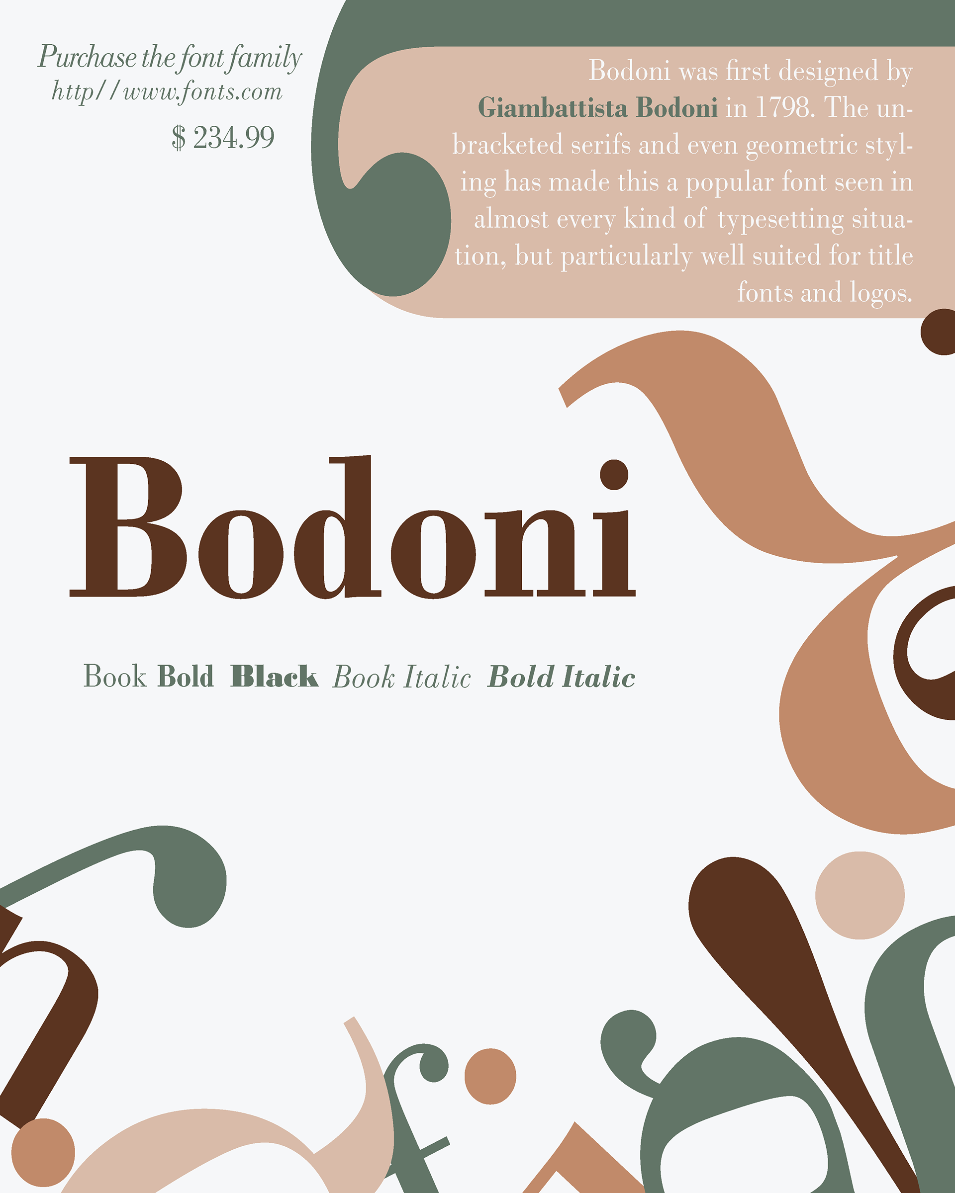
Victoria Jensen, a graphic design student, created this poster to highlight the unique characteristics of the Bodoni typeface, skillfully utilizing negative space to enhance its visual impact. Completed for ART 230.
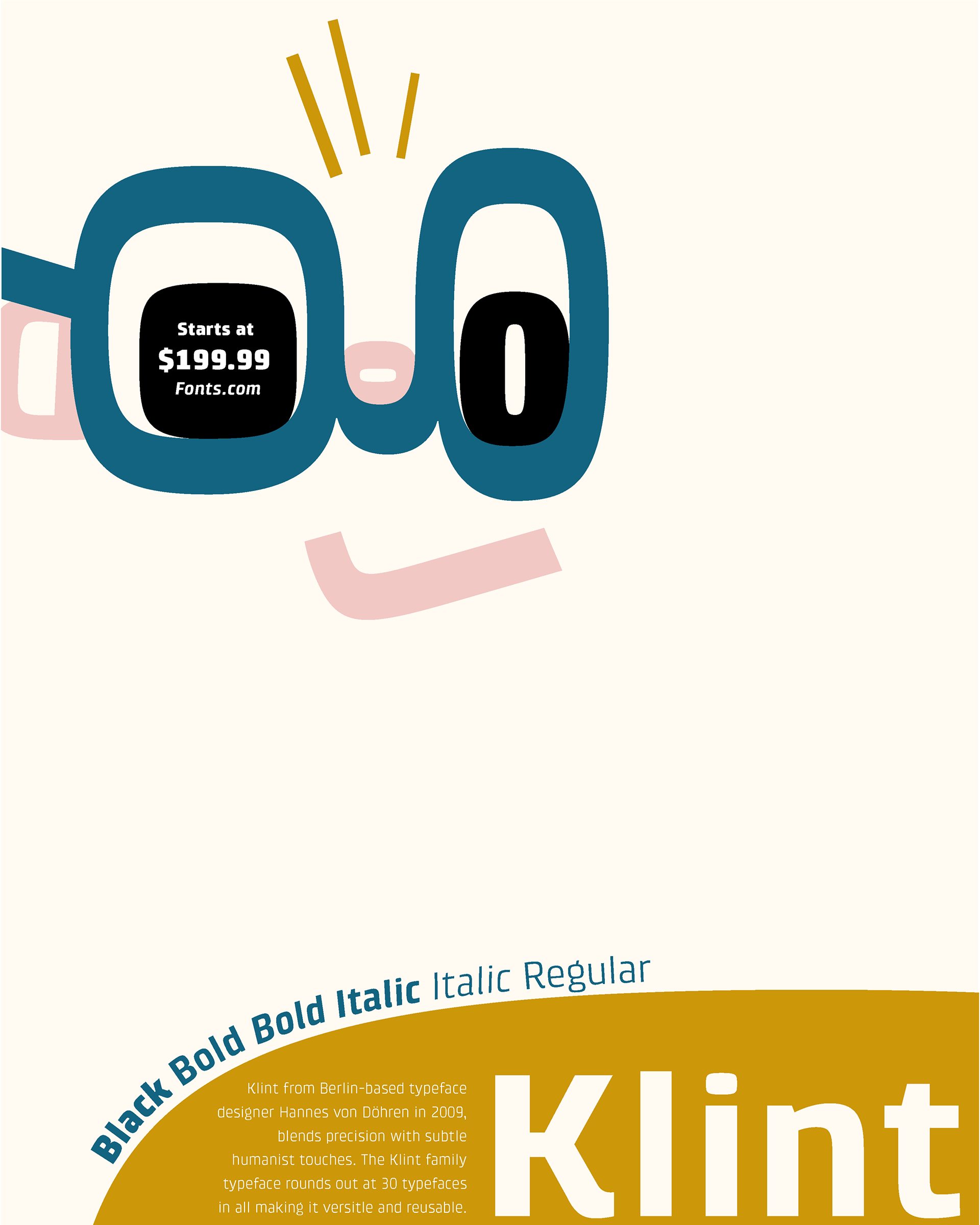
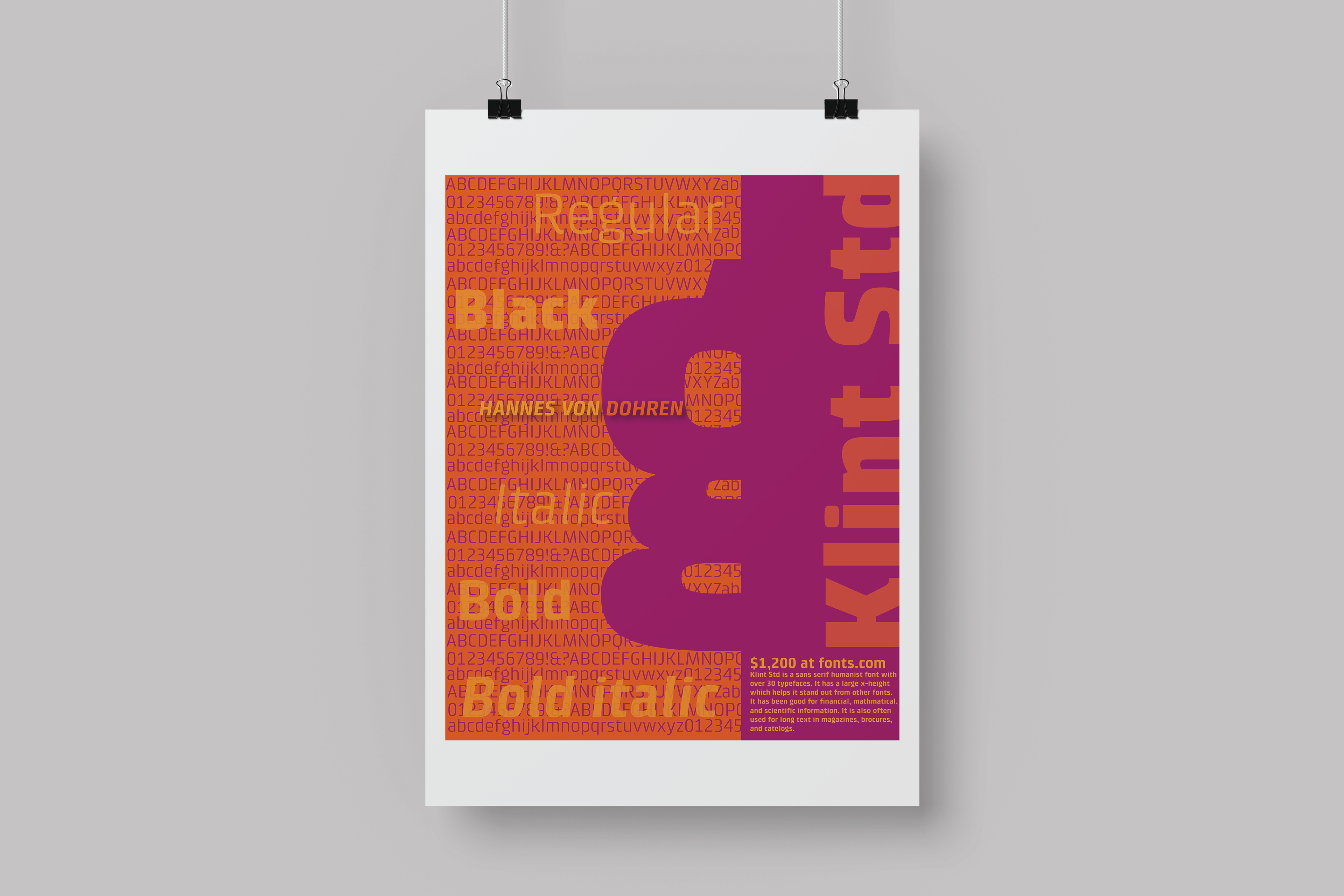
In 2022, student Jennifer McNeil designed this poster to showcase the Klint typeface, featuring a charming expression and an asymmetrical layout.
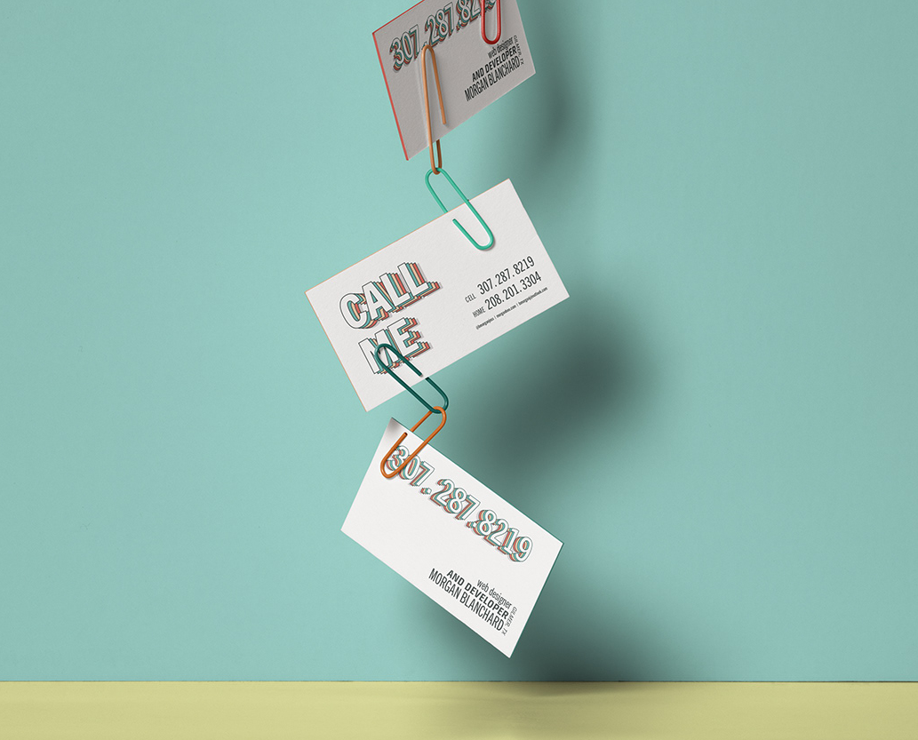
In 2021, Morgan Blanchard created a personal business card that demonstrated a kitschy overuse of drop shadows and negative space to create a streamlined and simple design, emphasizing the phone number and "Call Me" tagline. She used scale to create typographical hierarchy and a focal point.
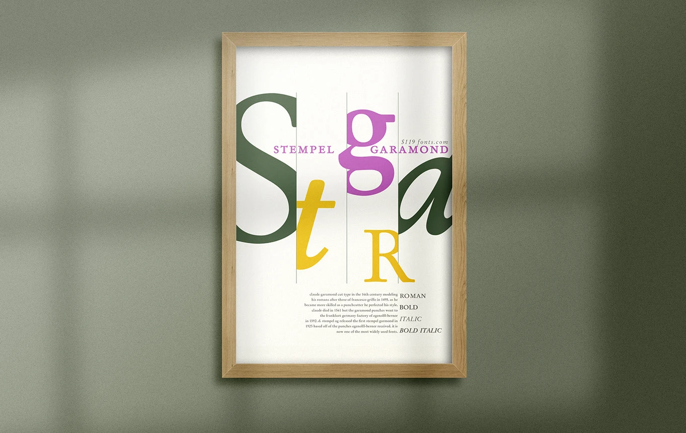
In 2022, student Karen Harris designed this font poster to highlight the defining characteristics of Stempel Garamond. Using the 'Lost and Found' design principle, she created visual interest through overscaled glyphs as a focal point and established structure with vertical dividing lines.
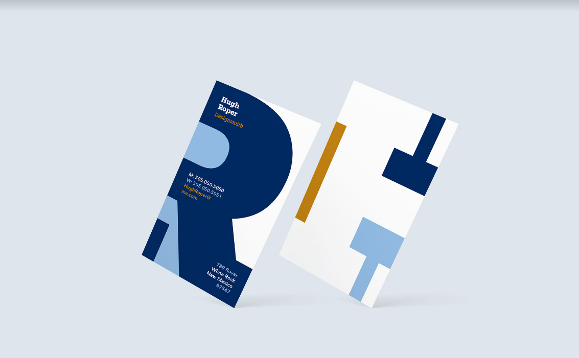
Hugh Roper Personal Business Card Design, 2024 — The front of the card features clear contact information, while the reverse side mirrors the visual style with a simplified negative space design, ensuring the front remains the focal point.
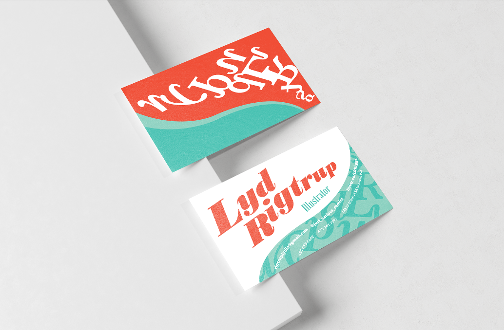
In 2024, graphic design student Lyd Rigtrup challenged traditional design conventions by creating a personal business card featuring expressive curved typography. She used color and scale to establish a clear visual hierarchy between her name, title, and contact information, which was further organized through the strategic use of bold and regular type weights.